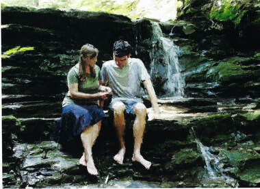
 Hi Folks, Publishing update: The Master of Hounds is through its editorial review. With my wonderful copy editor, Joyce Mochrie, this phase was something of a formality. Note: my publisher, Lulu, will sample a manuscript to determine and offer additional editing services if the need warrants. The next phase is cover design. This phase is critical. While it’s true, you can’t judge a book by its cover, the simple reality is that the cover is what catches a potential reader’s eye. Lulu breaks the cover design in two steps: cover copy polish and final cover design. What is cover copy? The cover copy contains the words you see on the back cover of your book. Note: for those books in hard cover with a dust jacket, this step also includes reviewing either a blurb taken verbatim from the book or your About the Author picture and bio. Like the actual cover image, which hopefully enticed your potential reader to pick up your book in the first place, cover copy is your “elevator pitch” that conveys something about the book to pique the reader’s interest. Note: the term elevator pitch is a general sales term—where the salesperson theoretically has only the time that it takes to get from one floor to the next in an elevator to sell a potential client. Thus, your pitch has to be concise and interesting to the potential reader. Talk about short! Most back cover copy runs from 150-200 words—so you have to start thinking early on how to sell your novel, that could easily run over three hundred pages, in two hundred words (or less)! Interestingly (and I think appropriately), Lulu considers cover copy as the final step in the submission process prior to the production phase. Cover design is part of the early stages of production. About Cover Design Cover design is putting it all together—the images that support the book’s story/theme and blend with the cover copy to catch the reader’s eye. How much time do you have to capture a reader’s interest? Some experts say three seconds (other experts say far less) to catch the person’s eye before they move on. Further, with your book's cover online with Amazon, Barnes and Noble, Ingram, or elsewhere, you have to make that image stick out in a 1” X 1” space.  Back cover from The Last Coon Hunter Back cover from The Last Coon Hunter What makes a book cover great? While we can probably agree on what makes a bad cover, you might ask if it's easy to identify a good versus great book cover? Not so much, but there are still some pointers on what makes a solid book cover. Let's take a look at the image on the right--the back-cover image to my first novel, The Last Coon Hunter. If this begins to feel a bit like an art analysis, you're getting the right sense of things. Sense of Theme. Any image should hint at your book's theme. The Last Coon Hunter takes place in the forests of Upstate New York: the waterfall is a good indication this story is about the outdoors. (New York State is not all New York City!) The placement of the characters, and their proximity to each other, hints there is, or will be, a close relationship between them. She's clearly showing him something—but what, and what does it mean? There's nothing wrong with adding a little mystery. Color and Impressionism. Again, the forest colors foster the theme of a rural lifestyle. The Ryland Creek series uses impressionistic images on all the covers and have maintained that look to help identify the series. Note: many books use "stock art" images of real models. That's fine, too, if you desire a realistic look. Some cover critics don't like back cover art as they say it takes up space for back cover copy. Hogwash! As long as you can get your planned cover copy on the back, I say give the reader a little more! Some Final Thoughts on Book Cover Design. Your cover is your first marketing tool. Therefore, take the time (and money) to do it right. And doing it right means:
0 Comments
Your comment will be posted after it is approved.
Leave a Reply. |
Categories
All
|
- Ryland Creek
- About The Ryland Creek Novels
- Buy the Ryland Creek Saga: Print Books
- Buy the Ryland Creek Saga in E-Book
- The Ryland Creek Saga in Audiobook
- Blog: In a place called Painted Post
- Reader Reviews for The Ryland Creek series
- Meet the Author:Joseph Gary Crance
- An Ode to Painted Post
- The Magical Realism of the Ryland Creek Saga
- Other local authors
- Contact
- Leave A Reader Review

 RSS Feed